Showing posts with label drawing materials. Show all posts

Saturday, September 1, 2018

3rd Entry for July 29, 2018


Alison, longer studies. Gerrard Art Studio session, July 29, 2018. Oil-based pencil and willow charcoal on paper, 18 x 24"

Friday, August 7, 2015

2nd entry for Aug 2, 2015


Not every drawing day is a good one. These are four 5-minute studies above, and two 10-minute ones below. It was not a good day for proportions staying in control, and I was having to work more slowly and redraw contours a lot to get them to work with  Pat's forms. The 5's are done with no preliminary marks, which for me makes the drawing especially high-focus as an activity, and more stressy in the moment - at least when things aren't flowing. With ink there's no retraction of marks, so every moment hold the potential for collapse if my attention or hand wavers.
10 minutes and up I have time enough to do some looser sketching, to block in key forms in pencil. I try to keep that to 2-3 minutes, or there's no time left. Loose pencil marks are open-ended, non-stressy and help catch the most egregious proportion problems. But losing the feeling of drawing on the edge of a cliff means the ink lines are different when aided by a pencil sketch; they can lose some of their tension and `bite' as marks.
An idea that interests me currently is what is the least amount of pencil sketch that would support a line drawing the most, and eat the least time in the bargain. Drawing things twice over is redundant; what is the most organic effective shorthand for me? What info do I absolutely need, and what can I fill in with a more detailed line?

Monday, November 25, 2013

Entry for Nov 15, 2013


On the Friday evening, I got out to part of the open session at the TSA. Carmina was working that night, and I was continuing to explore combinations of brush pens.
These are a couple of 15-minute studies above, and a 20-minute one below.
The top study is Pentel brush pen, India ink wash in another brushpen, with oil-based pencil and pan pastel added later, on 18 x 24" Canson Recycled Sketch paper.
The second one is the same combination of materials on an 18 x 24" sheet of Canson XL Drawing paper. The bottom one is Pentel black brushpen and dilute india ink added with a second Pentel pen.
I find the middle one a little too `pretty', but like the crispness and economy of the bottom one.

Friday, November 15, 2013

2nd entry for Nov 7, 2013


Lighting was limited, and was switched from underlighting to sidelight partway through the evening. Kat, a friend of the Ren's, was interested in trying out being the sitter and stepped in for a few poses.
These are two 10-minute and a 15-minute study above, a 10-minute and two 15-minute ones below that.
In life drawing sessions I mostly draw people altogether undressed. It's interesting how having some garments - and what type - can shift the character of the drawing. Underlighting can add a degree of drama to images of people, too.
These are all done with Pentel brushpen with dilute India ink shading applied with a fairly broad waterbrush on 11 x 15" sheets of paper. The top two are on Canson XL Drawing paper, and the lower four are on Canson Watercolour paper. I like the very spare shading marks on the portrait study. It would be nice if there was such a thing as a `fine' brushpen, with half the bristles of the Pentel one, as the brushpen line has a lot of character, but gets heavy very easily, at least for me.

Thursday, September 12, 2013

2nd entry for Sept 1, 2013


These are all roughly 50-minute studies, done with water-soluble graphite washes on 18 x 24" sheets of heavy Maidstone paper.
I'm feeling optimistic about the way that these allow for much of the fluid freedom of the Copic pens, but with a bit more grain and are lightfast, too.

Friday, July 12, 2013

3rd entry for July 2, 2013


These are some 10-minute studies also using the warm gray Copic gray scale markers and a Pitt medium black liner pen in places in the top one.
During the session with Meredith (June 21) I was using the broadest range of different value pens to date.   Both for speed and effect, I started thinking that having a reduced range of value steps spread between light and dark is probably better for me, so in these I was mostly using a 20%, 30%, 50% and 70% gray. I have a 90% that I held in reserve for things like Samantha's shadowed hair.
I'm used to coaxing a range of values from drawing tools, so in principle a 50% gray can be anything from 1% to 50% dark if used strategically enough, and 70% can add all but the darkest of the mid shadows.
The transitions are smoother with more in-between steps, but I'm starting to think that is something to be deployed strategically in places, as opposed to everywhere. Leaving some seams and joins visible may be more visually engaging than seamlessness in fast studies.

Saturday, December 8, 2012

1st entry for Nov 11, 2012


Those of you who visit here semi-regularly have no doubt noticed the sudden lack of my incessant postings. A couple of game-changing, life-changing events took place in the last two weeks, which make the time before it feel like some distant happy bubble.  The pace of life is now settling again, and there are leftover images I've yet to share.
On that Sunday night, Angela was back at the TSA. I had just finished a day and a half of delightfully challenging and inspiring time drawing a super talent pool in a Series 808 dance workshop.  During the day I was using a pigment pen for its speed and directness, so I carried that on to to working with Angela's gesture poses. These are 1-minute studies, done with a Sakura Graphic 3 pen on 18 x 24" bond paper sheets.

Monday, July 2, 2012

2nd entry for June 15, 2012


These are some 15-minute studies, plus a 10-minute one that ended the night.  For the top three I tried a paper I hadn't used before called Durotone Butcher White paper. It has a waxy-smooth, somewhat mottled surface. The top study was done on it with hard Nobel charcoal, while the next two were done with HB Conte crayon. It was the first time in ages I had tried Conte, but I still found it a bit coarse-looking on the more rigid paper.  I had a feeling that either the Durotone Extra White or possibly the Butcher White would be especially good, but some of my initial enthusiasm for the Butcher White paper may be chalked up to `Magic Bullet' syndrome: the feeling that a given new material is THE answer. It takes multiple trials to really see how a paper behaves. The sheets are 24 x 36"

The lower study is Nobel hard charcoal on an 18 x 24" sheet of Canson Recycled Sketch paper, with some light tones added using a Prismacolor black drawing stick, which gave a very fine-grained gray on that paper. It wasn't a wholly successful likeness, but the more fine-grained tonality it adds is interesting to me.

Wednesday, March 21, 2012

4th entry for Mar 13, 2012


These are 5-minute studies, done on 24 x 36" sheets of Durotone paper.   Durotone is slicker than the Maidstone I've been using, and is big, but not prohibitively expensive.
I had brought along the five sheets, and was okay with how it performed with the hard compressed charcoal, so I'll likely explore this further.

Monday, January 30, 2012

2nd entry for Jan 17, 2012


These are three 20-minute studies of C-   , and a 15-minute one at the bottom. All are on sheets of 90 lb Maidstone paper.
The top two are on 11 x 22" half-sheets, while the lower two are on 22 x 30" sheets.
The top one is done with soft graphite, and the one below with hard compressed charcoal. both half-sheets are very lightly toned with charcoal powder. The smaller surface area made me inclined to try more close croppings of the figure.
The third one is just hard compressed charcoal, and the lowest one is the same charcoal with a more pronounced charcoal underlayer.
At this point it has been striking me what a difference a very small amount of surface tone makes to the character of the drawing. Even a small dusting away from white really registers as a markedly darker final image.

Saturday, January 28, 2012

1st entry for Jan 15, 2012


On the Sunday, I went the TSA to do some sketching during the day. L-  was working.  On an oversight, I forgot to pack my little box of various charcoals.  I had some of the rectangular `super black' charcoal with me, so I started with that. The top image is a 10-minute study, using that on 18 x 24 Canson Sketch paper.

I observed that I was lacking materials, and one of the other drawers loaned me a stick of Conte compressed charcoal, from an old box she had. The lower two are 15-minute studies on sheets of the same paper, using the Conte charcoal. I liked the texture of it quite a bit- it wasn't a deep black, and had a hard but creamy texture like a cross between General's charcoal and Nupastel.  I was intrigued enough that I sought some more for myself.

I was a bit disappointed when I took out some of the new Conte charcoal. The texture was more waxy, the pigment blacker, and the sticks far more brittle than the one from Sang's much older box. It reinforced my sense that Conte's quality has materially changed in the last few years, and not for the better.  Too bad, as they were a `gold-standard' art material company for decades.  But now package redesign seems to be getting more emphasis than content. I'd be happy with vintage packaging, if I could depend on what's inside to perform really well.

To be fair,  it is possible that time alters the nature of their charcoal binder, and my new stuff may come round to behave like the older stick in 10 years, but I doubt it, somehow.

Tuesday, December 20, 2011

4th Entry for Dec 8, 2011


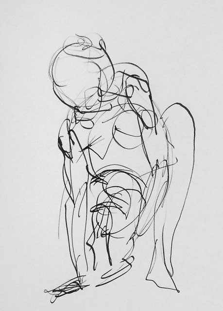
These are a 15-minute  study above, and two 20-minute ones of K -   below.
All are done with Nobel hard compressed charcoal on 18 x 24" sheets of Canson Sketch paper.

I do have a tendency to get brief crushes on new materials if they show promise. During that time a part of me thinks "maybe this is the `magic bullet' material that will perfectly realise my desired shading and mark-making.  At that point I'm only noticing the things that the material does that I like. Gradually I begin to notice where the limitations of a given drawing material or paper are.

A component of how one handles a material or paper is familiarity. I find it takes time to achieve the muscle memory of just what touch and pressure works best with any given combination, and it is only after some practice that I can have the trust to work most freely with a chosen combination of paper and drawing materials.  I've probably drawn upwards of ten thousand studies on newsprint sheets in my life, so it is very much a known quantity. When I find a paper or drawing material with potential, I try to give myself a stretch of time without judgment, just seeing how it behaves, to resist the temptation to think while working, "Is this working really well? How about now? And now?'.  Unless I don't like the feel or texture at all, it's worth doing a hundred or two studies, and then seeing how it worked out.
Over the last year, I've been working through a number of different possibilities. I suspect that, barring some magic material, it is in the combination of a couple of materials that a given paper's potential can be best exploited.

In 2009, virtually everything posted here was Conte crayon on newsprint.
In 2010, I started exploring Japanese paper and generic cartridge paper, with super-soft graphite, and Prismacolor drawing sticks
This year, the papers tried have been: more Japanese papers,  Canson Sketch, generic bond paper, a roll of Strathmore 300 series acid free paper, and Maidstone 90 lb acid-free paper, plus a few odds and ends of other Canson papers.
Materials tried have been- U-Art woodless charcoal sticks,
Royal `super black' sketching sticks,  Nobel woodless charcoal sticks, Progresso woodless pencil crayon, willow charcoal and powdered charcoal.

Monday, December 5, 2011

1st entry for Nov 28, 2011


On the Monday night, D-  was at the Ralph Thornton Centre.  I had done some research into the mystery charcoal and determined that it was Nobel brand. While picking some up at De Serres (a local art store that stocks that), I also saw a Progresso brand woodless black colouring pencil which looked quite appealingly dark.
The top two studies - a 1-minute and 5-minute one respectively - are both the Progresso pencil crayon on bond paper. It was silky-smooth, but didn't get much purchase on the smooth bond I'm getting from Aboveground Art Supplies. Nice for gestures; not so hot for how I like to build darker shading, but not too smeary either.
The next 5-minute study below is Progresso crayon with a bit of Conte crayon to help things along in the darker areas, on the same kind of 18 x 24" bond paper as the top two.
The lower one is a 10-minute study with hard compressed Nobel charcoal stick on 18 x 24" cartridge paper.

I might add that what I refer to as `cartridge paper' these days is more specifically Canson `Sketch' brand paper, from their XL series of 18 x 24" pads.
I really wish they would introduce a 22 x 30 or 24 x 36" XXL series of pads for this...