Sunday, August 28, 2016

Thanks for stopping by...

Hi if you've recently come across this blog.
I've posted life drawings on here quite extensively, from late 2006 through to 2015.
I didn't stop working then, but I've mostly moved posting of new work to a tumblr I keep - you can connect to it here.

Now and then I'll add new material, or cross-post relevant stuff from tumblr, but by and large this is the repository of older studies.

Chronologically, what you can find here is:

  • mid-2010 to 2015 - explorations in more archival materials


  • mid-2006 to mid-2010: archival quality be damned, I'm going to have fun drawing with Conte on big sheets of newsprint.


It's a nice deep archive of studies; I hope you enjoy, and thanks for visiting!

Comparison: Recent Drawings to Older Newsprint Ones


Newsprint meets Toned Papers:
(This is the continuation of some points explored in the previous three posts) 
The Conte crayon drawings I have done on 24 x 36″ sheets of Newsprint are some of the work of mine I like best. But over the last few years I have tried some alternate media to capture what I like about them on a better surface. Here are five current drawings, done with oil-based pencil on hand-coloured paper, beside comparable newsprint drawings. 
The new ones are a third to a quarter of the size of the newsprint drawings, but the balance of line/tone, and the even-ness and luminous quality of shading are in a similar ballpark - I believe these are the closest of everything tried so far. 
But these colour ones are on acid-free paper, which is sturdy enough to allow for post-session additions and amendments, and lasting enough to make that worth trying, so I’m optimistic about the future explorations they allow. 

Summary Report: Toned Papers, Part 1


Toned Papers, Part 1:
For some time I have been exploring alternatives to drawing on newsprint. I found that for my sensibilities, drawing with Conte crayon on large sheets of newsprint had an ideal texture for direct figure drawing. But the newsprint has no longevity. 
Earlier this year I began experimenting with adding washes of ink to better quality paper to draw on. This came in  conjunction with finding an oil-base pencil, Cretacolor Nero, whose marks I liked: they are less coarse than Conte and `smoother’ than charcoals.
The early ones I’ve been doing used more muted greys with small amounts of colour mixed in, echoing the newsprint look that I have a fondness for. Also, black marks look less stark when there is some underlying midtone, rather than white paper.

Summary Report: Toned Papers, Part 2


Toned Papers, Part 2:
More recently I've been exploring how a base tone washed on paper contributes to the drawing I’m doing. Starting March/April of this year (2016), I began using washes of more vivid hues. 
I found a paper I like, Stonehenge light weight, and began using Daler Rowney FW acrylic ink for the colour washes. The drawing is done with Cretacolour Nero oil-base pencils.
There are certain limitations. I stretch the paper to wash colour on, but it’s thin enough that working in water media while drawing would buckle the surface a lot. The colour layer can come off with heavier erasing, so I try to keep erasures to a minimum.
It’s having promising results so far, and allows for a few directions of exploration, making images of people. I hope you are enjoying these as well- I’m having a good time making them. You can follow the progress of this on my tumblr.

Recap: 2006 - 2011, the newsprint years


Newsprint Drawings:
The human form never ceases to fascinate me, and I have always enjoyed making images of people’s bodies.
Newsprint does not have great archival value, but I really enjoy it as a surface to draw on. In fact, I’d rate it as my favourite surface to draw on. In the mid-2000′s  I gave over a lot of time to what I think of as `direct drawing’: no under-sketching, minimal planning and no erasure. I was using 24″ x 26″ sheets of newsprint, with Conte Crayon. 
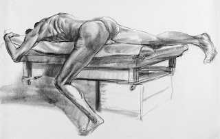
I felt at the time like it was the most honest working process, and there was an energy, a confidence and a vitality to the drawings. These are a few of them.  The big sheets of paper made for very physical drawing, and I found the `grain’ of the shading strokes worked very well for shadow on skin. 
Using any material over an extended period of time, the speed and confidence of handling ramps up. By 2010, I was able to get good strong images done in 10 - 15 minutes, and 25 minutes or up got into overworking territory. (There is no rule anywhere that drawing has to be a speed process, but fast drawing has a certain urgency embedded in it, and short time spans allow people to do a lot more with their bodies.) 
At the time, I did not feel I could ethically sell work like these due to newsprint’s rate of decay. (But I am re-thinking just how vulnerable it is, especially if mounted on a good support - for sure, it would go through colour changes) . But by the end of 2010, I resolved to find smaller, not-too-costly media that would allow for what I liked about the newsprint drawings to happen on a better-quality surface. that investigation has led through a lot of different materials and papers that I’ve tried since then.
There is a certain special quality and luminance of shading to Conte crayon on newsprint, and the nuance of it gets lost  in the translation to other papers. I look back at all these  Conte/newsprint drawings and studies as a bit of a `golden age’ for me - they were so easy and fun to do, and people enjoyed seeing them. But looking back through my archive, many weren’t that strong after all.
If you look at posts here from Oct 2012 on back,, you can judge for yourself. Out of four or five thousand studies, maybe 20% are the stronger ones, at least in hindsight.